Branding & Theming
Turning a 13-day enterprise setup process into a 1-day, self-serve experience.
Employee Slate is ServiceNow's AI-native, conversation-first employee experience portal. Branding & Theming is the first thing every admin configures in it — a logo and color palette applied across the entire product, before a single employee sees it.
My role
I led the end-to-end user experience of Branding & Theming, from research and ideation through design and launch. I collaborated closely with cross-functional teams to take it to a successful GA release.
I partnered with 2 Product Managers, 2 Engineering Managers, 9 Engineers, 1 UX Researcher, and 1 UX Writer.
My approach
Empathize
Understand the user's need, pain points and context.
Conceptualize
Transform insights into ideas and shape a clear vision for the solution.
Design
Bring the vision to life with user-centered design and iterative refinement.
Talked to the implementation team
Interviewed 4 people from ServiceNow's implementation team to understand the user's needs and pain points and current workflow of configuring the branding and theming.
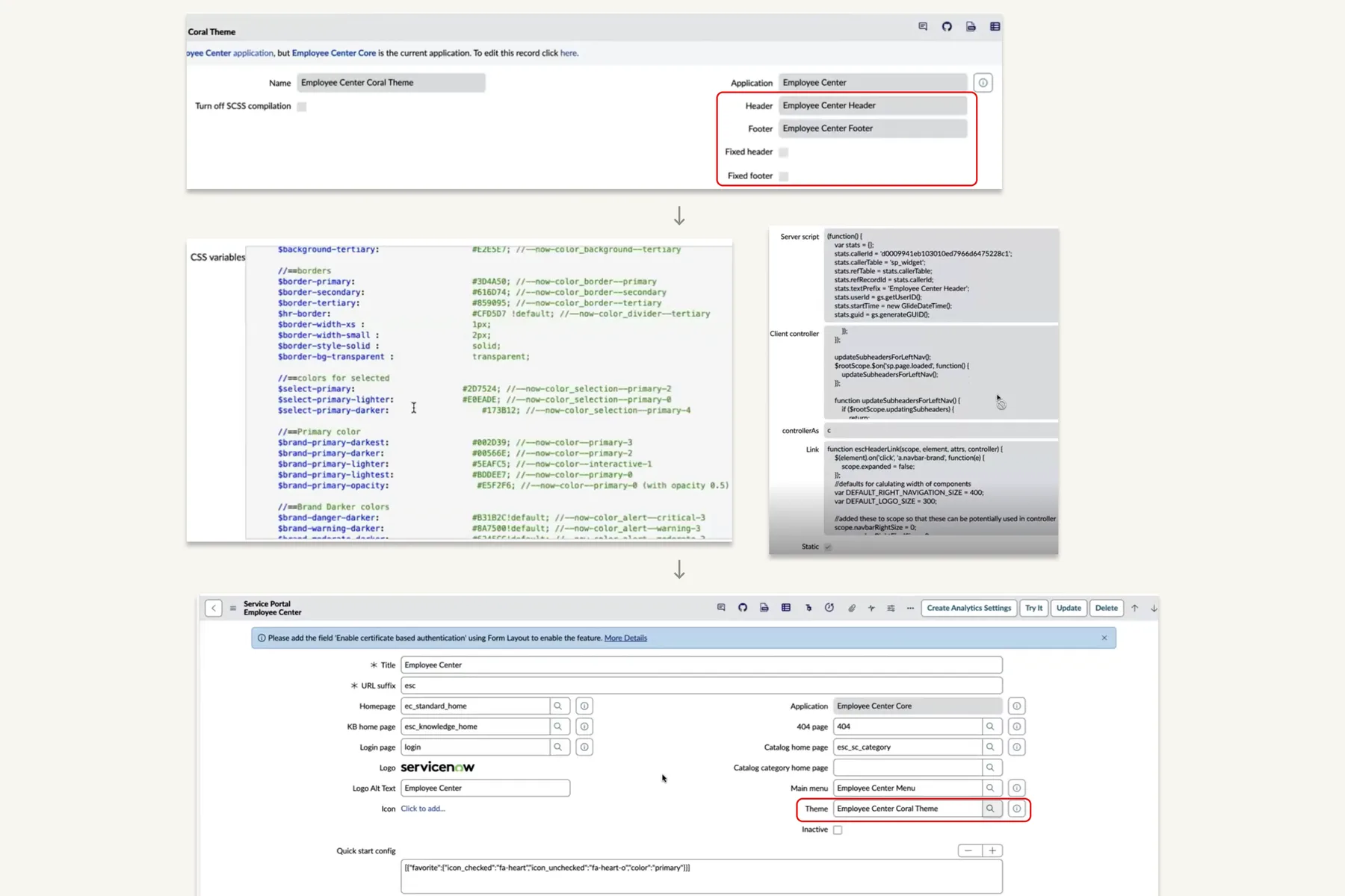
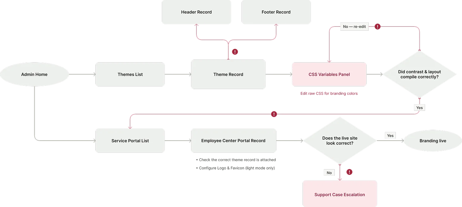
Investigated how users currently do the configuration, what all steps are there and their dependencies.
Findings
Branding was spread across multiple configuration surfaces
A single branding request could require changes across portal configuration, themes and CSS variables.
Simple visual changes could require technical expertise
When customers needed customization, they often had to work with CSS and other technical configuration.
More flexibility created more implementation effort
The experience exposed a large amount of customization, but that flexibility also increased the number of decisions, troubleshooting scenarios, and support dependencies — which often led to support case escalations.
Explored the market
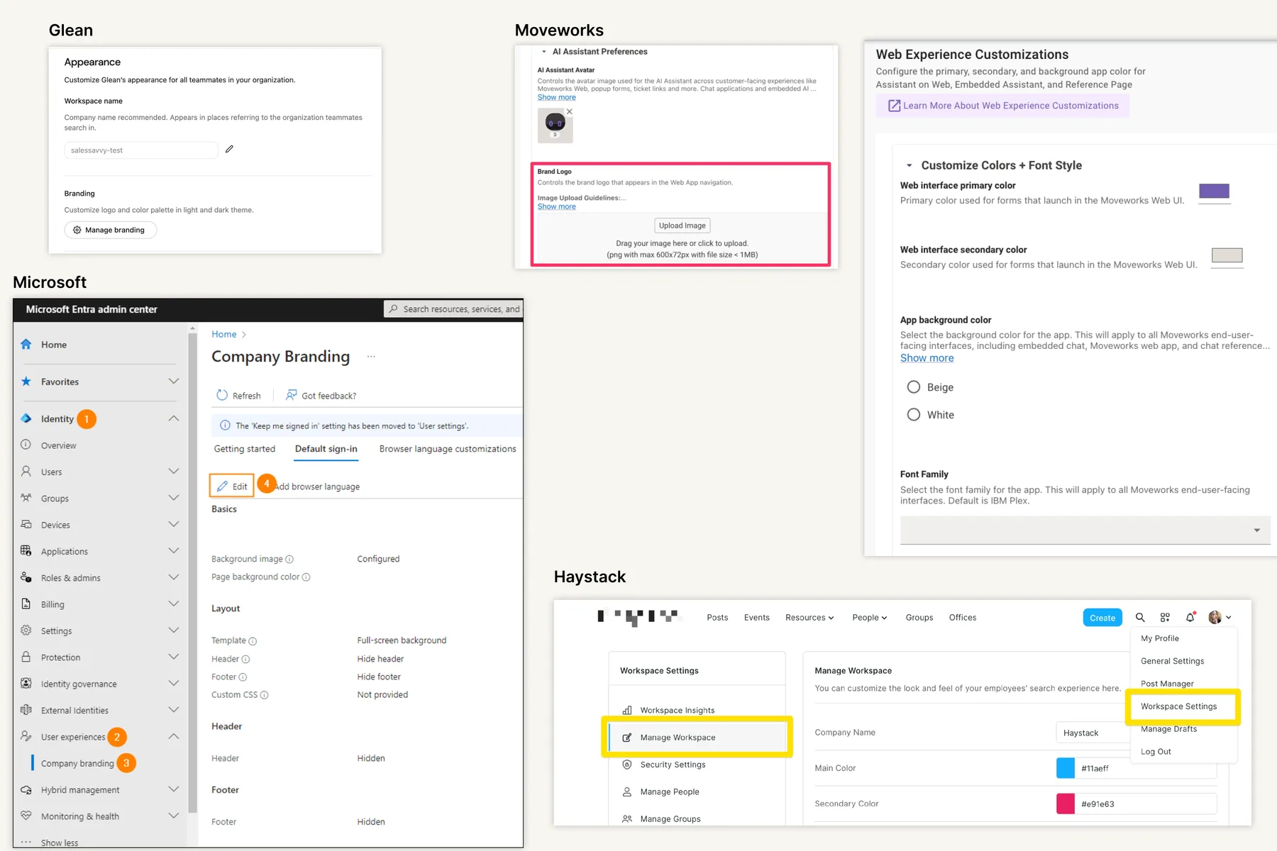
Analyzed Glean, Moveworks, Microsoft, and Haystack, to understand how other enterprise platforms approach setup and theming.
Focused on how admins set up and manage the branding and customization and overall user experience.
The Real Complexity
Design Challenge
How might we let admins configure branding and theming — without navigating multiple disconnected tables, or writing CSS?
Facilitated a Design Thinking workshop
- Brainstorming ideas against all 3 HMWs
- Share and affinity mapping
- Dot voting
- Impact vs. effort matrix
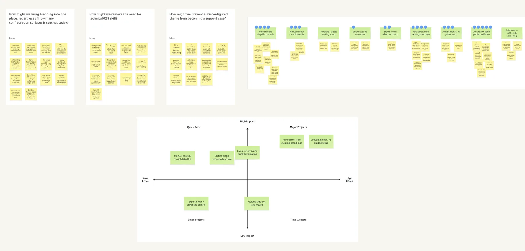
Explorations
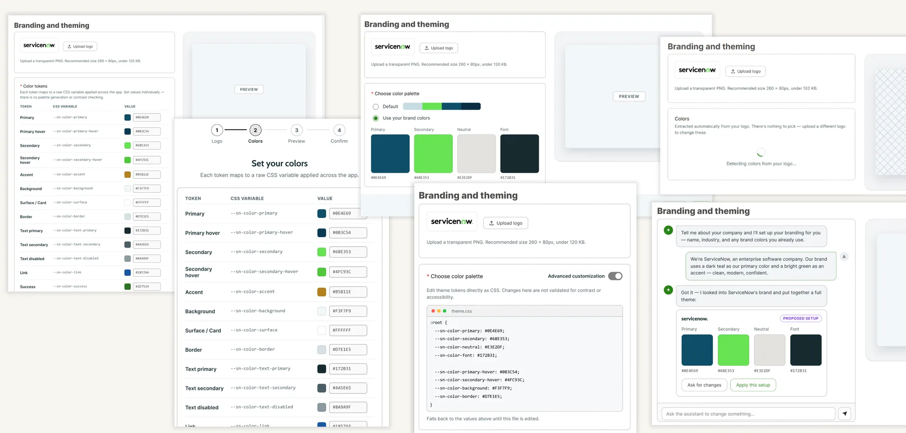
Two Directions
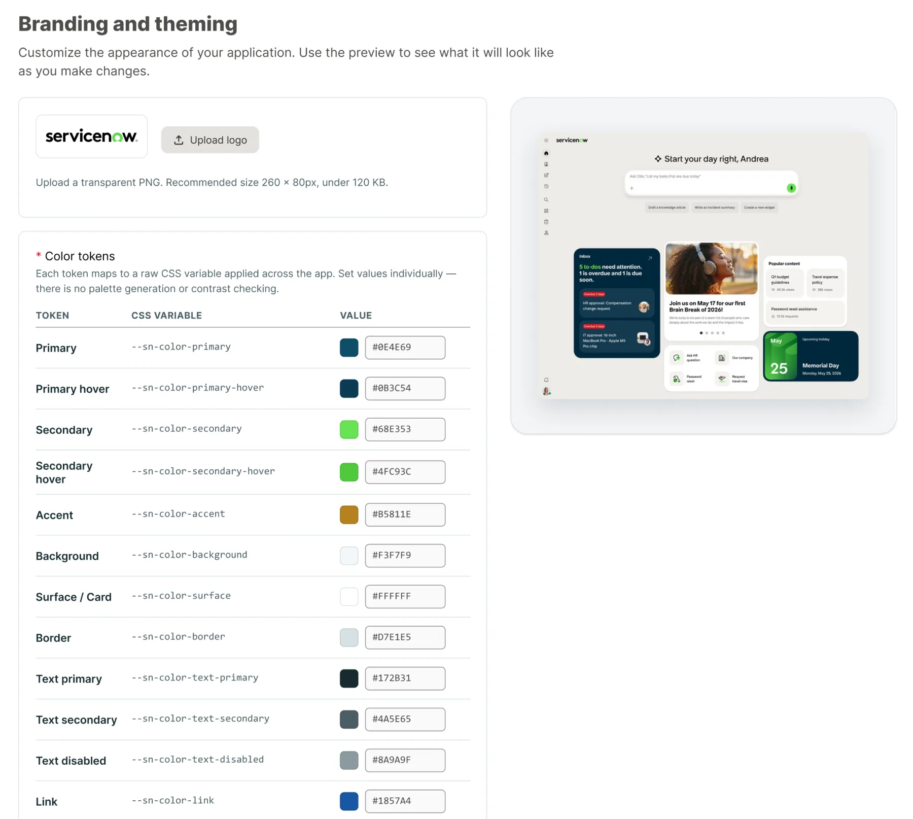
Maximum control, zero guardrails — every choice unverified for contrast or consistency.
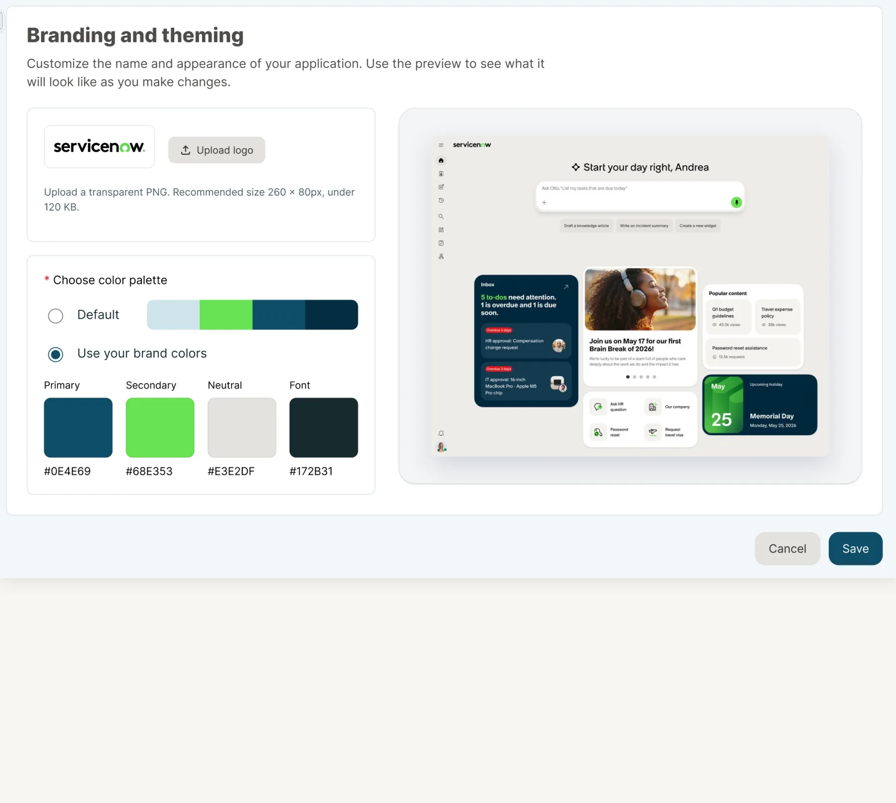
Fewer decisions for the admin — the system fills in the rest, and you can see the result before you commit.
A/B Testing to Validate
With EA a few weeks out, there wasn't room for a full round of external customer testing — so I validated both directions with 6 implementation specialists, who see every misconfiguration firsthand.
- Direction B was favored unanimously.
- Testing also surfaced real requirements neither direction covered: the portal's display name, URL customization, a separate logo for dark theme, and a favicon — all folded into V1's scope.
Version 1
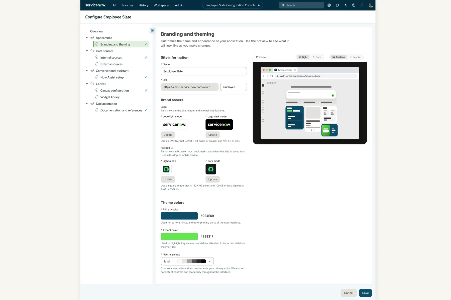
- Smart defaults, fully editable — every field ships pre-filled out of the box. Admins can update anything, nothing is locked.
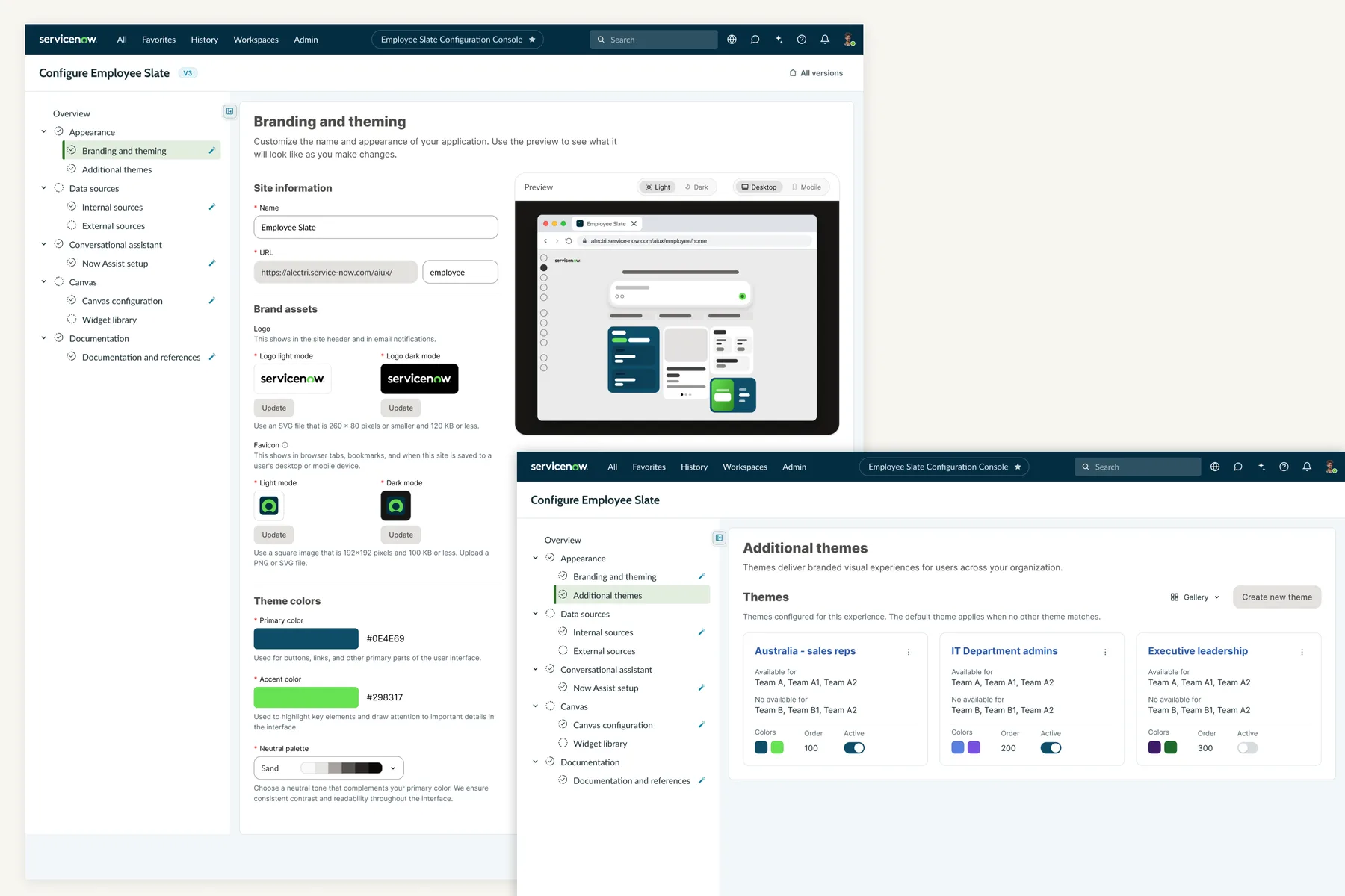
- One console — site info, brand assets, and theme colors live together, with a live preview, no more jumping between screens.
- Three inputs, one algorithm — an admin picks a primary color, an accent color, and a neutral palette. LeonardoLeonardo is Adobe's open-source, contrast-based color generation tool. Given a set of key colors, it mathematically generates a full color scale that meets WCAG 2.0 AA contrast ratios — rather than relying on manual, by-eye color picking. — Adobe's open-source, contrast-based color engine — generates the full accessible theme automatically, with contrast ratios built in.
Admins get brand control, not unlimited color control — accessibility and system consistency stay protected by design.
Feedback from EA
Different themes for different audiences, inside a single instance — not one theme for the whole org.
The New Challenge
How might we enable enterprises to deliver contextually appropriate, branded themes — so each user gets a relevant experience based on company, department, location, or role — while keeping the admin simplicity intact?
Version 2 - Additional Themes
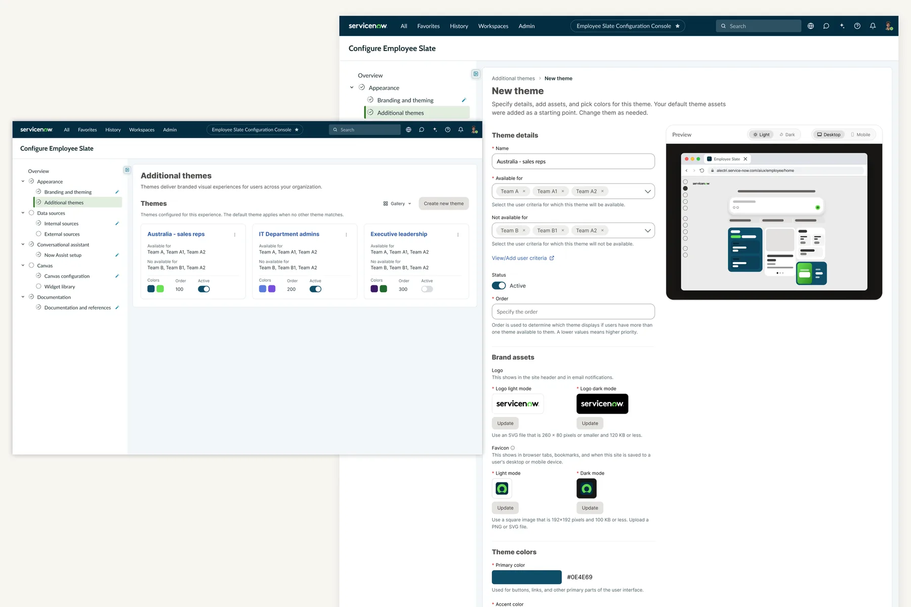
- Themes target specific audiences — team, department, location — rather than replacing the org-wide default.
- An ordering system resolves which theme applies when a user matches more than one.
- Additional Themes reuses the V1 branding model rather than introducing a parallel configuration system.
A simpler configuration experience
Self-serve configuration
Reduces dependence on technical setup and manual CSS.
Simplified theming
Gives admins meaningful controls instead of implementation-level settings.
Accessible color generation
Helps maintain consistent, usable color relationships automatically.
Live preview
Gives admins confidence before publishing — light/dark, desktop/mobile.
Additional Themes
Extends the model to multiple, audience-scoped enterprise brands.
22 Early Adopters
- Unblocked GA for the customers who had flagged multi-theme support as a blocker.
- Extended rather than replaced the V1 configuration model.
- Established a foundation for audience-targeted experiences beyond theming.
Reflection
I started by designing a branding experience. I ended up designing a theming system.
The best configuration experiences don't expose the complexity of the system. They turn that complexity into a small number of meaningful decisions for the person using it.