Employee Slate
Reimagining the employee portal as an AI-native experience.
Employee Slate is a new AI-native employee experience designed to help employees get work done across their enterprise — bringing together conversational experiences, personalized content, tasks, requests, and other employee workflows.
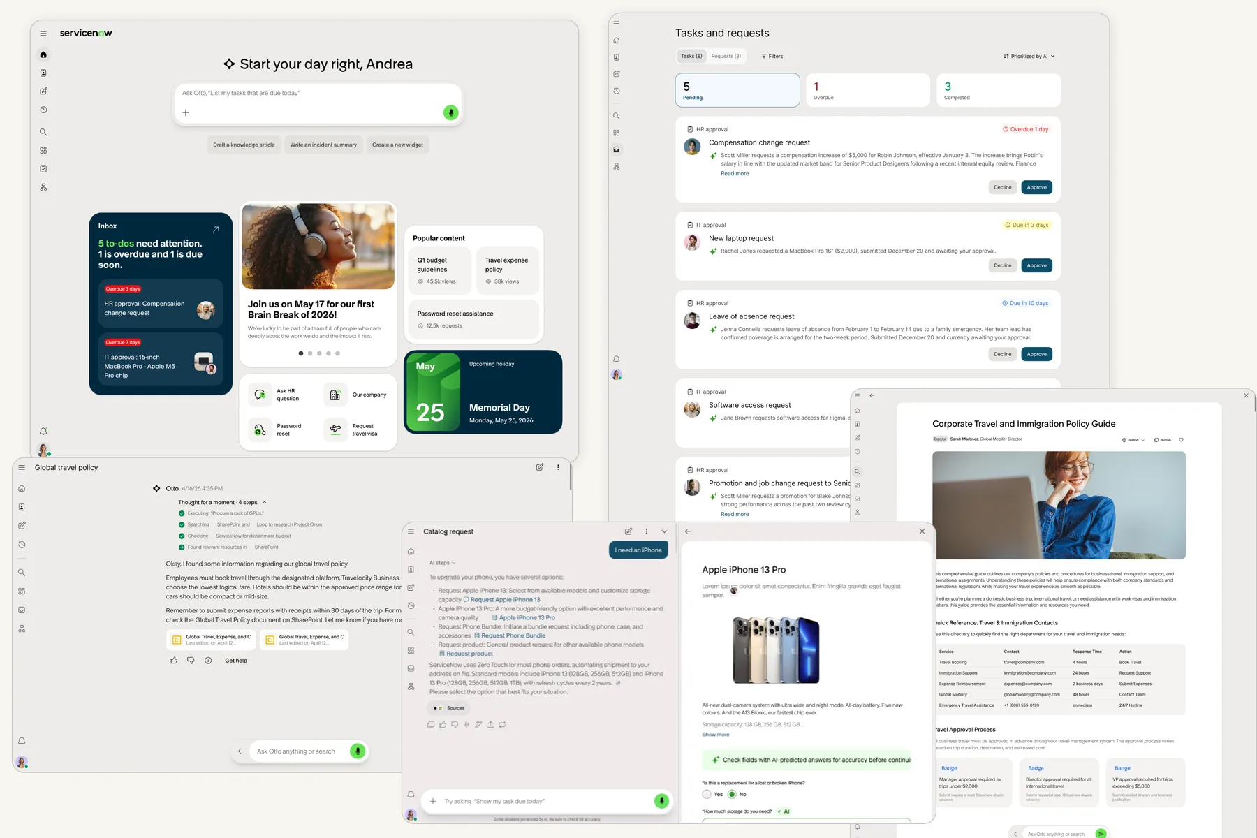
My ownership
I owned the Tasks & Requests experience end-to-end — from framing the problem and exploring the information architecture to defining AI prioritization, AI summaries, inline actions, and the final shipped experience.
The challenge
Employees were navigating tasks, approvals, and requests scattered across multiple widgets and pages just to understand what needed their attention.
Prioritize → Understand → Act
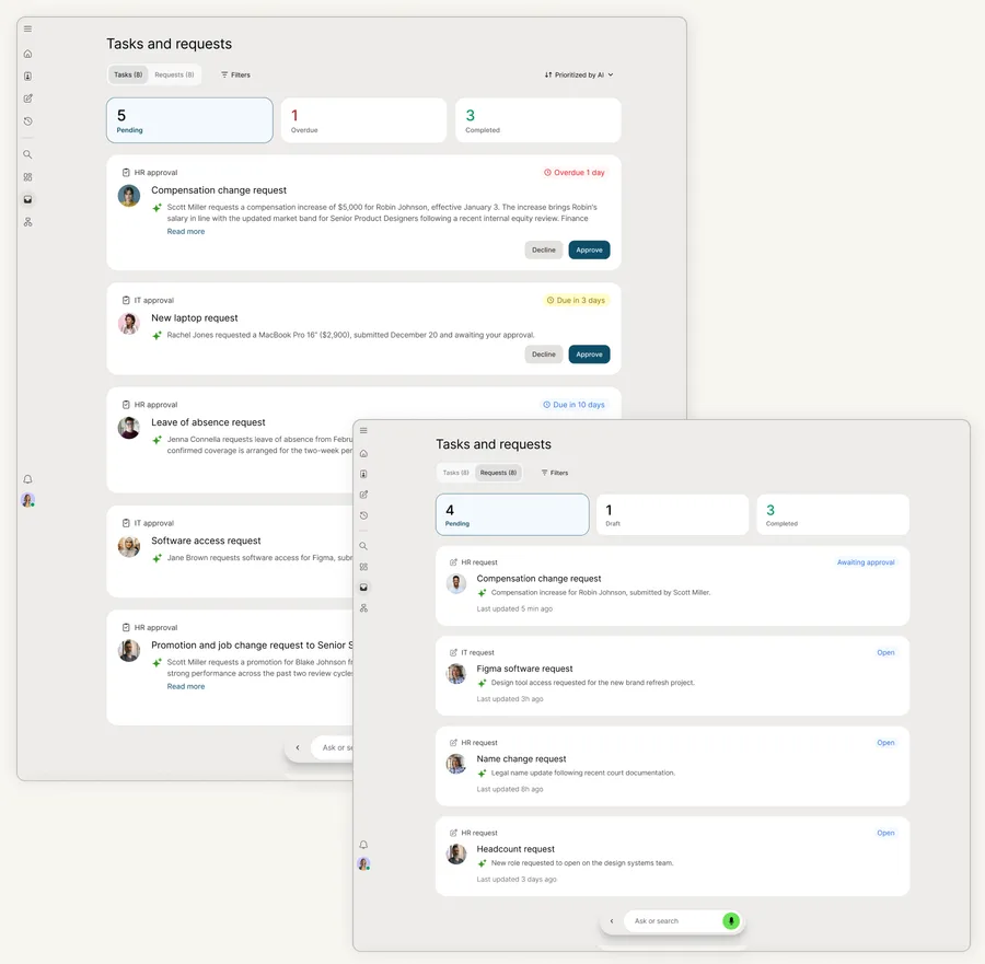
Work scattered across multiple places.
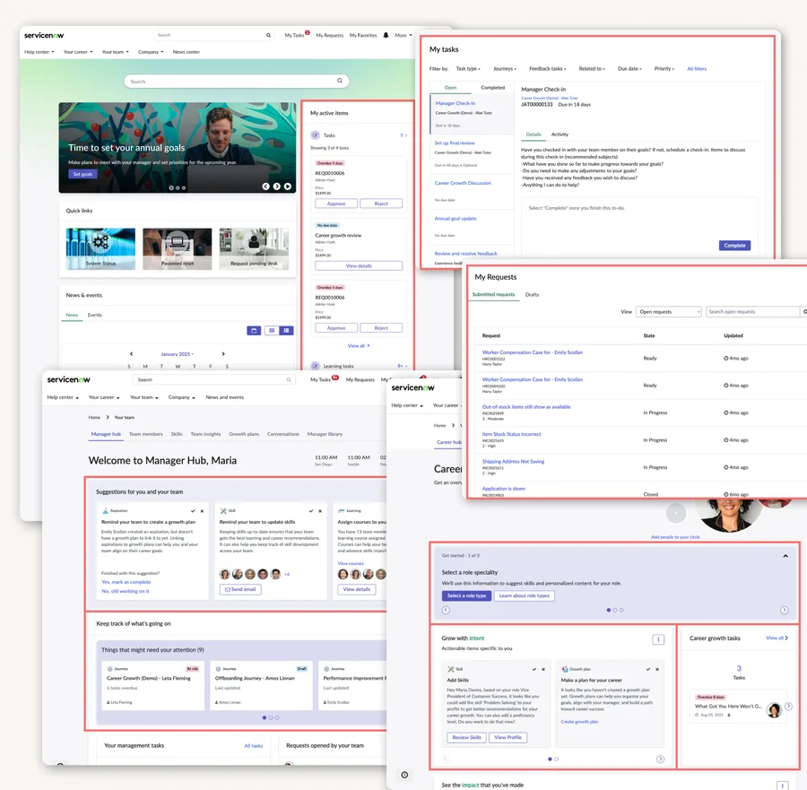
One list, prioritized and summarized by AI.
Post-GA measurement shows how employees discovered, understood, and acted on their tasks and requests.
5 early-adopter enterprise customers · 6.2k task-active employees · 21.6k actionable tasks · 8 weeks post-GA
Employees completed more work without leaving the task list.
AI helped users identify and understand important work, but didn't materially accelerate the path to action.
Next opportunity: move from summarizing work to helping employees make decisions.
How we got here
The shift to an AI-native experience
Employee Slate wasn't a redesign of the existing Employee Center Pro experience. It was a new direction for how employees interact with enterprise work — with AI and conversational experiences becoming part of the experience from the start.
Within that shift, I focused on Tasks & Requests: rethinking how employees prioritize, understand, and act on the work waiting for them.
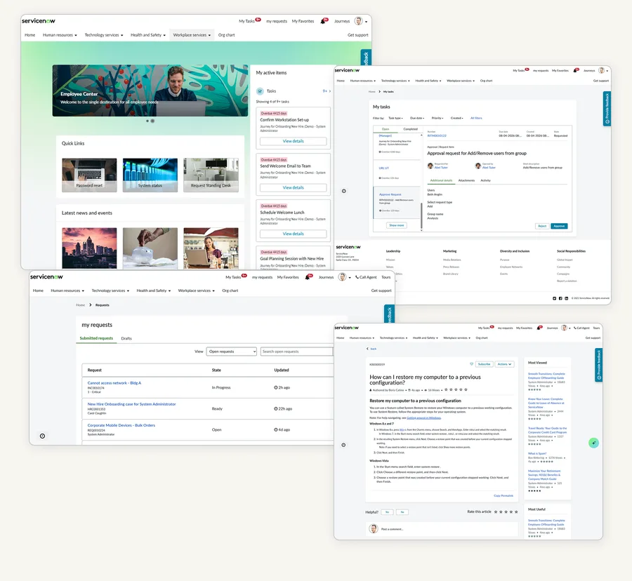
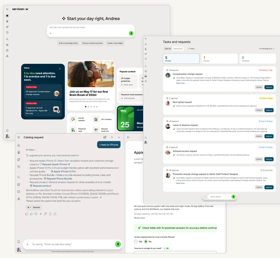
Employees were navigating tasks, approvals, and requests across multiple places to understand what needed their attention.
Work was fragmented
Tasks and requests could appear across different areas of Employee Center, requiring employees to remember where different types of work lived.
There was no clear priority signal
When employees had multiple tasks, they had to interpret due dates, urgency, and context themselves to decide what to handle first.
Understanding took extra effort
Employees often had to open a detailed view to understand what a task was about before deciding whether to act.
The opportunity became: Prioritize → Understand → Act.
What I learned before designing
Rather than starting from a blank canvas, I went back to existing research and customer feedback from the old Employee Center Pro experience.
One pattern stood out: employees didn't necessarily need another place to browse. They needed a faster way to get to the work that mattered.
I then looked at how productivity products brought work together. Across the products I reviewed, work was typically organized through lists, status, assignee, or due date. Less common was an explicit signal for what deserved attention first.
Competitive patterns: organizing work vs. helping users prioritize
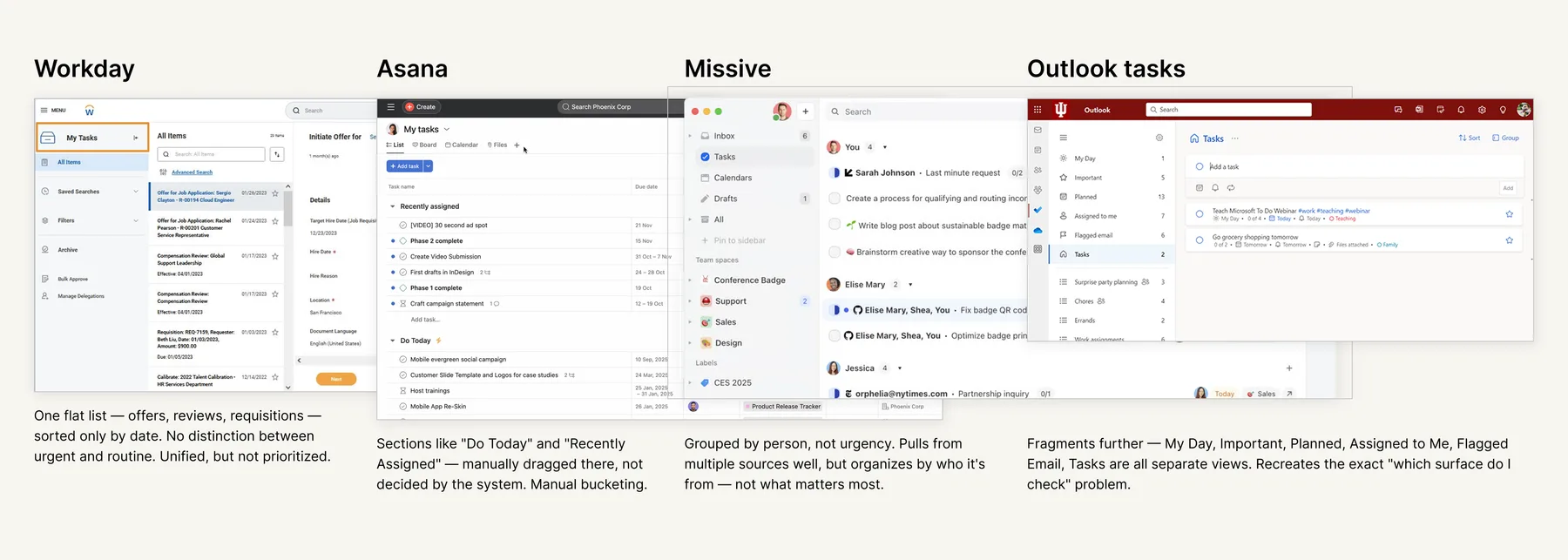
A unified list makes work easier to find. A useful work queue should also help employees decide where to start.
The design question
How might we help employees know not only what work exists, but what deserves their attention first?
From finding work to knowing what to do next.
I explored several structural directions for bringing Tasks and Requests together before converging on a simpler model built around three decisions: what to focus on, what the work is about, and what action to take.
WHAT SHOULD I FOCUS ON?
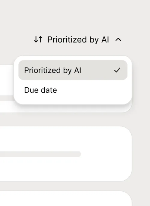
Instead of presenting employees with a flat list, I explored how AI could surface the work most likely to need attention first.
The prioritization model considered signals such as urgency, due date, criticality, and task context to rank work dynamically.
WHAT IS THIS ABOUT?
Once employees found a task, the next question was understanding it quickly.
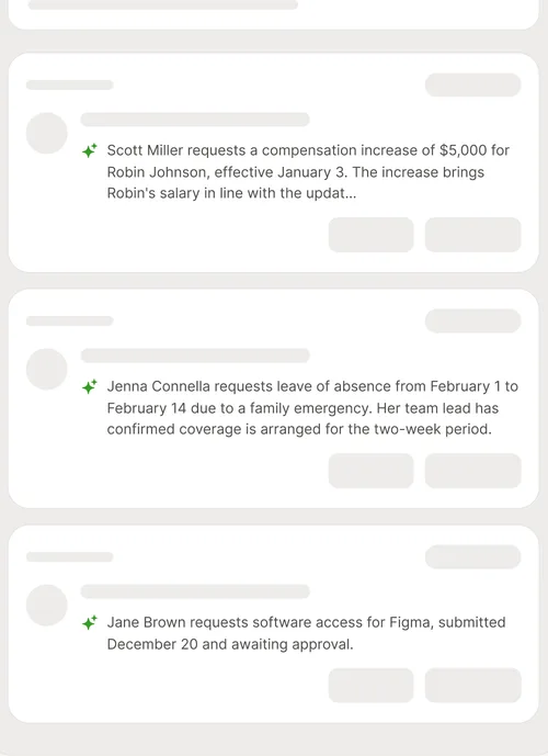
Each task card surfaces an AI-generated summary that gives employees the key context without requiring them to open the detail page.
WHAT CAN I DO NOW?
Once employees understood the task, the final question was what they could do next.
Actions such as Approve and Decline sit directly on the card, removing the need to open the detailed request experience before acting.
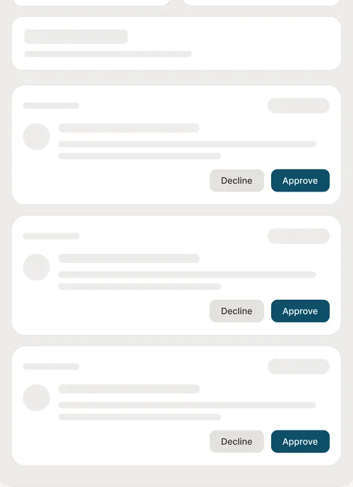
Prioritize → Understand → Act
The experience was designed to reduce the distance between knowing what needs attention and getting it done.
The first design direction wasn't the final one.
Usability testing exposed an important problem with how work status was organized. In the initial design, completed items were mixed into the filtering experience, making them difficult for participants to locate.
The feedback prompted me to rethink the status hierarchy — not just where completed work lived, but how employees could quickly identify the work requiring attention.
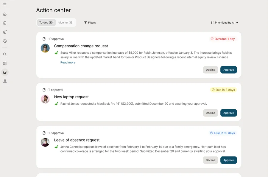
Completed items were difficult to locate within the filter structure.
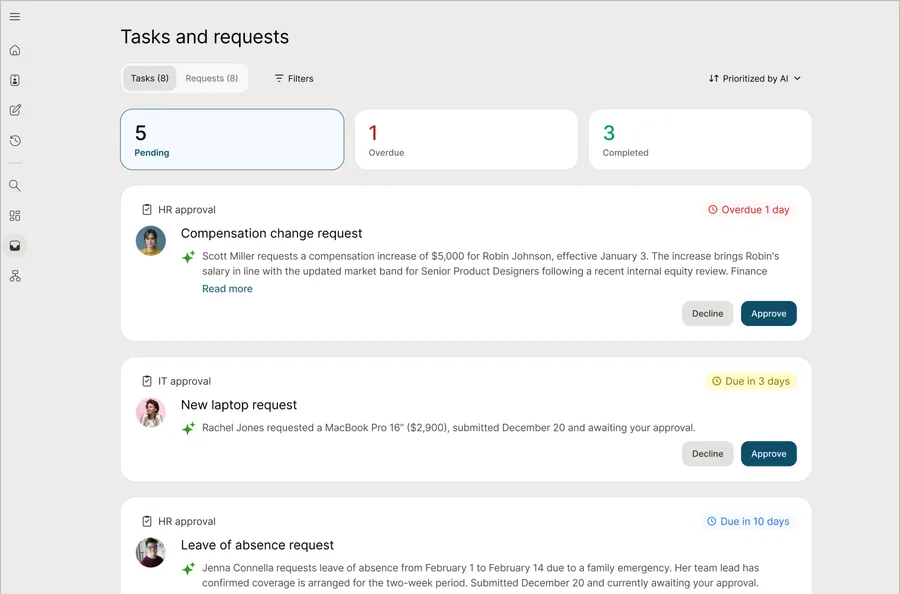
Overdue & completed work is surfaced upfront with a count, letting employees go directly to the tasks that need attention.
Testing also exposed a naming problem: "Action center" and "Monitor" didn't communicate clearly to participants, which led to the final "Tasks and requests" naming.
The takeaway
Bringing work together isn't enough. The structure still needs to help people understand what needs their attention.
One place to manage work, with AI helping employees know where to start.
The final Tasks & Requests experience brings tasks and requests together, while making it easier to prioritize, understand, and act on work.
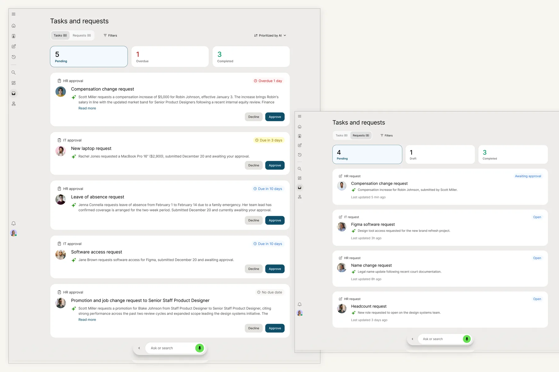
AI prioritization
Ranks work based on signals such as urgency, due date, criticality, and task context.
AI summaries
Gives employees the key context directly on the card.
Inline actions
Lets employees complete common tasks directly from the card.
Status and filtering
Makes pending, overdue, completed, and other states easier to understand and manage.
I owned Tasks & Requests end-to-end within a larger cross-functional team.
I owned the Tasks & Requests experience end-to-end, from framing the problem and exploring the information architecture to defining the AI prioritization, summaries, inline actions, and final shipped experience.
A significant part of my role was aligning the experience across design, product, engineering, and the wider AI-native direction.
Understanding a task isn't always enough to act faster.
The first version helped answer two questions: What should I look at? and What is this about?
Post-GA measurement suggests there is still an opportunity between understanding a task and taking action.
The next step: help employees decide
I would explore how AI could surface the information employees need to confidently decide what to do next — such as why a task is prioritized, what makes it important, and the decision-critical context behind it.