Making performance reviews easier to set up, track, and manage
I led the end-to-end redesign of Workforce Now's Performance Management review experience — simplifying setup, making review progress easier to understand, and helping HR practitioners identify what needs attention.
I led the design direction from scope to shipped experience.
Sr. UX Designer · Design lead
I led the design direction for the Performance Reviews refresh end-to-end — defining the scope, prioritizing the highest-impact workflow, synthesizing research into design priorities, and owning the experience from setup through review-cycle tracking and individual review management.
The challenge wasn't adding another feature. It was simplifying a system that had already grown complex.
Workforce Now's Performance Management module supported 25,000+ client organizations, multiple review types, and three user groups — HR practitioners, managers, and employees. Rather than redesigning the entire module, I first narrowed the scope to where client usage and workflow complexity overlapped.
Start with Common Date Reviews for HR practitioners — the highest-volume review type and the role responsible for configuring, monitoring, and intervening in the workflow.
This became the focused starting point for the refresh; the other review types remained outside the first scope.
Across feedback, support data, and research, the same pattern kept appearing.
Three problems kept showing up
Setup was fragmented
Review-cycle status was difficult to understand
Tracking made it hard to know what to do next
These three problems became the three design challenges that shaped the rest of the project: simplifying setup, making review-cycle status clear, and helping HR practitioners identify and act on individual reviews that needed attention.
Before designing the solution, I mapped the review at three levels.
The module serves HR practitioners, managers, and employees across a shared review lifecycle. I mapped it end-to-end to understand what needed to be configured, where the overall cycle stood, and where each individual review was within that cycle.
This gave the redesign three clear moments: configure the review, understand where the cycle stands, then act on the individual reviews that need attention.
Three key moments
From a fragmented setup process to a guided review builder
Creating a review cycle meant configuring information across multiple disconnected areas—and manually figuring out how those decisions affected one another.
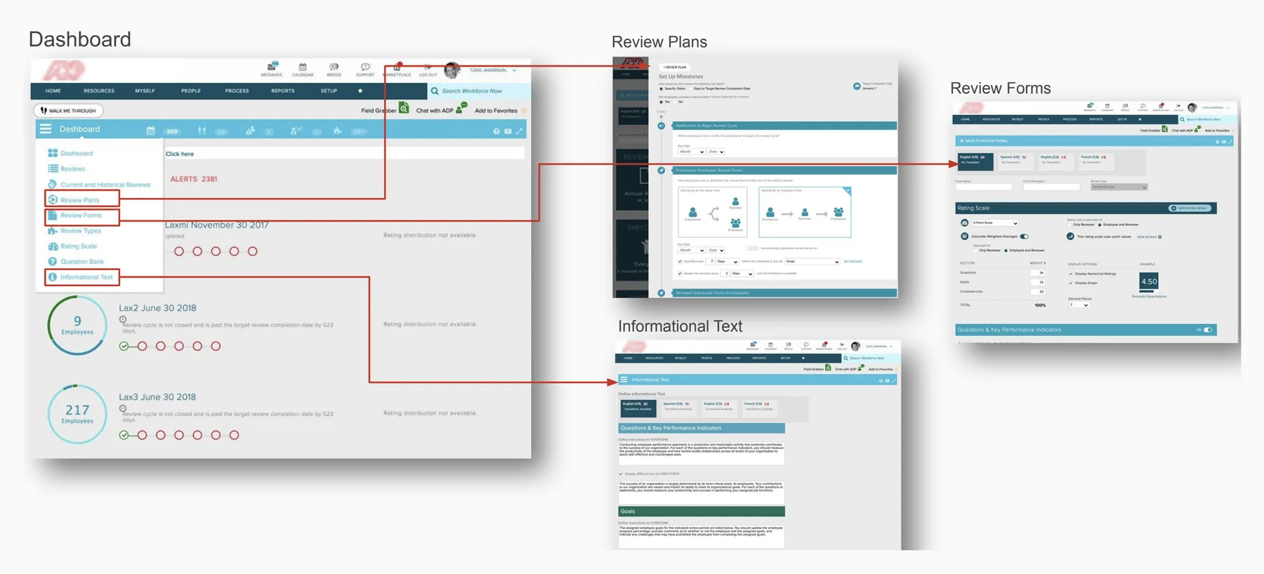
The old setup distributed related decisions across multiple surfaces.
Who was included affected the review scope. Milestones determined when actions happened. Reminders depended on those milestones.
Rather than expose everything at once, I structured the experience as a guided sequence, allowing each decision to build on the previous one.
A single guided setup flow replaced the fragmented configuration experience.
The hardest part was making the system's logic understandable without making the user do the work.
Performance reviews contain a lot of dependencies: evaluation periods determine milestones, milestones determine deadlines, and deadlines determine reminders.
The design challenge was to keep practitioners in control without making them manually manage that underlying logic.
From configuring dates to reviewing a timeline
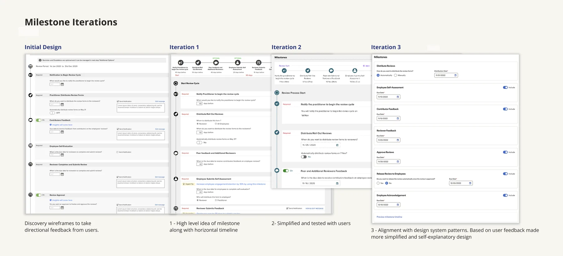
Instead of making HR practitioners construct the review timeline from scratch, the system established a starting point and let them adjust it.
From calculating dates to configuring intent
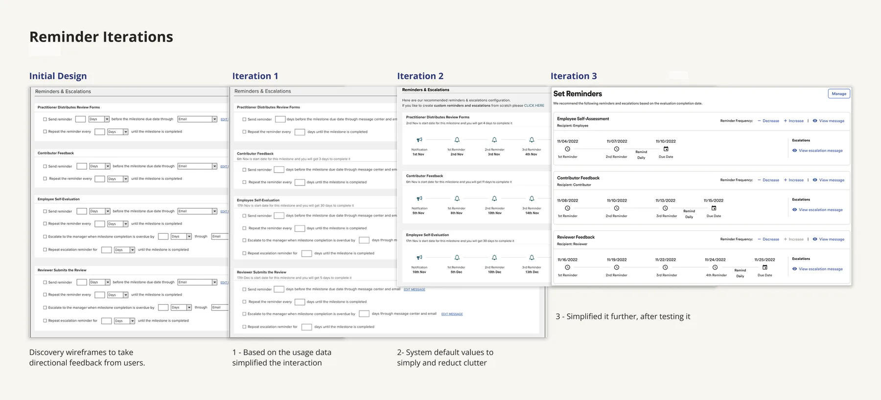
System defaults and a visual schedule let practitioners define the reminder strategy without manually calculating every date.
Patent outcome
The reminder/escalation interaction was reviewed by ADP's legal team, resulting in one granted design patent and one utility patent filing.
From "Where are my reviews?" to "What needs my attention?"
The old landing page showed review cycles, but didn't help practitioners understand which ones were active, what was coming next, or where intervention was needed.
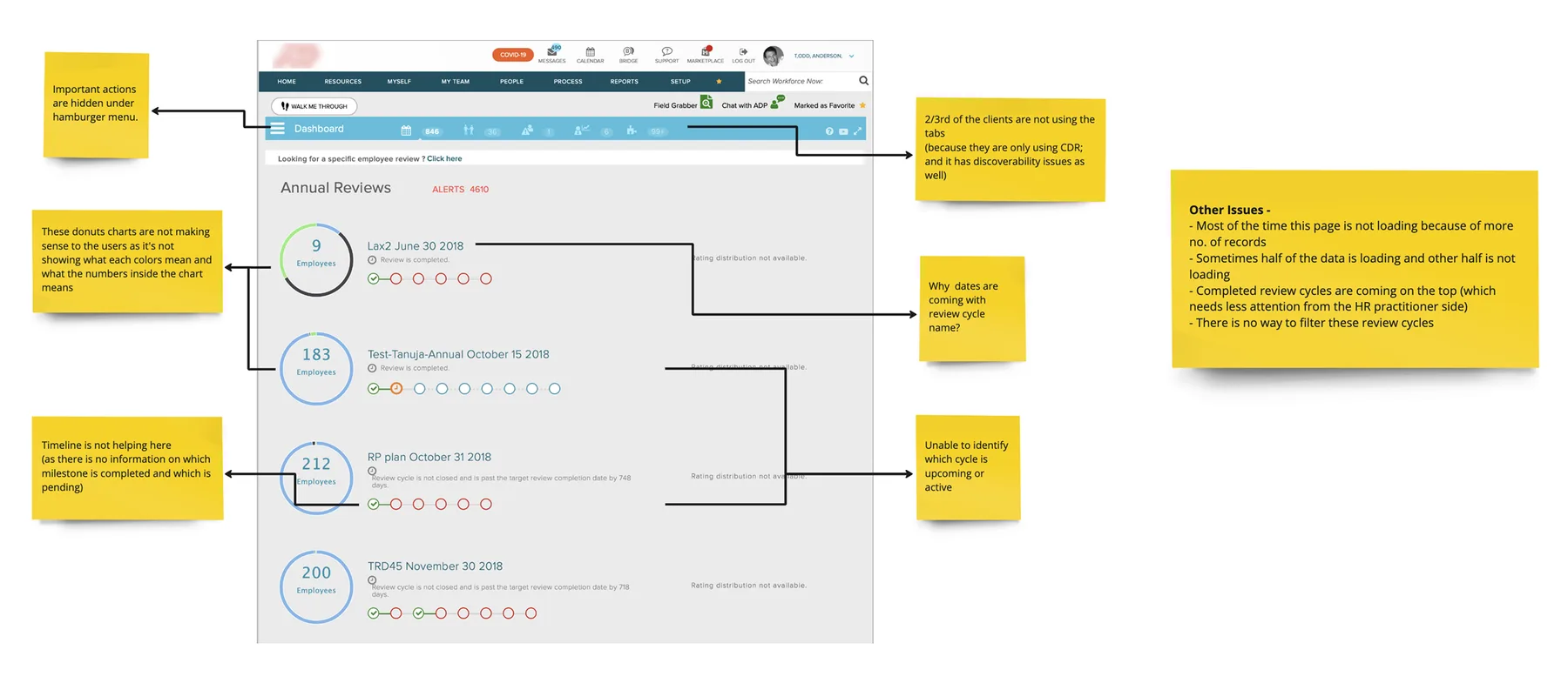
The old page showed information, but made prioritization difficult.
The status visualization didn't communicate meaningful state.
Completed cycles competed with work that needed attention.
There was no way to filter cycles, and performance degraded at higher record counts.
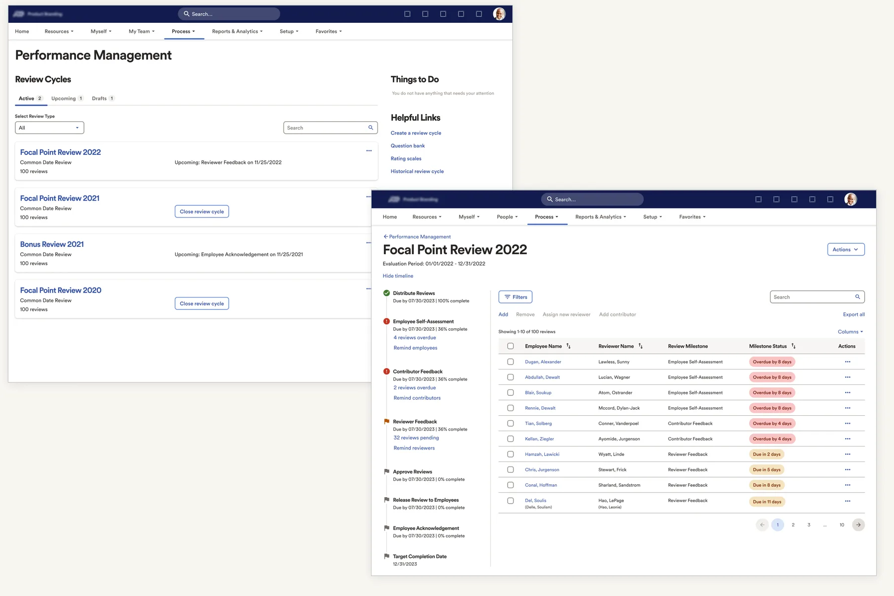
The final landing page
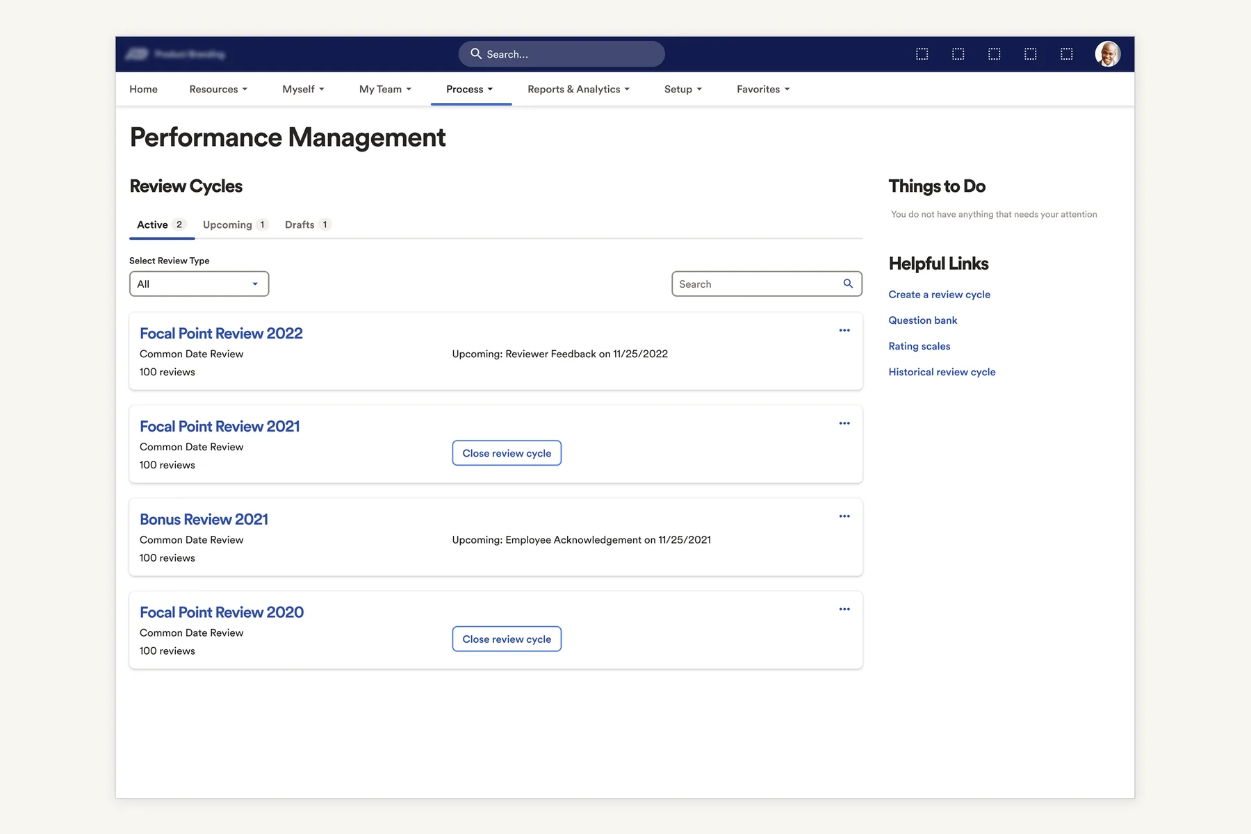
State told practitioners where each cycle stood, while the page surfaced the work that needed attention.
From tracking status to knowing who needs attention
Knowing which review cycle needed attention was only the first step. Inside a cycle, HR practitioners still needed to identify which employees were behind, what stage they were in, and what action to take.
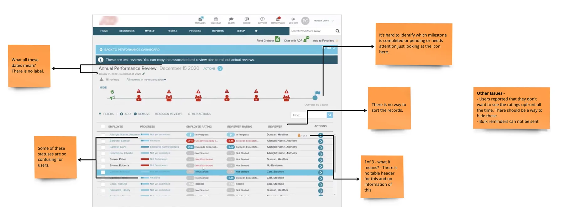
Timeline showed sequence, not meaningful progress
Status labels described state but not action
Finding and following up on reviews was manual
Design decision
The direction that shipped treated the timeline and table as complementary views — one for understanding progress, the other for taking action.
The final review cycle detail page
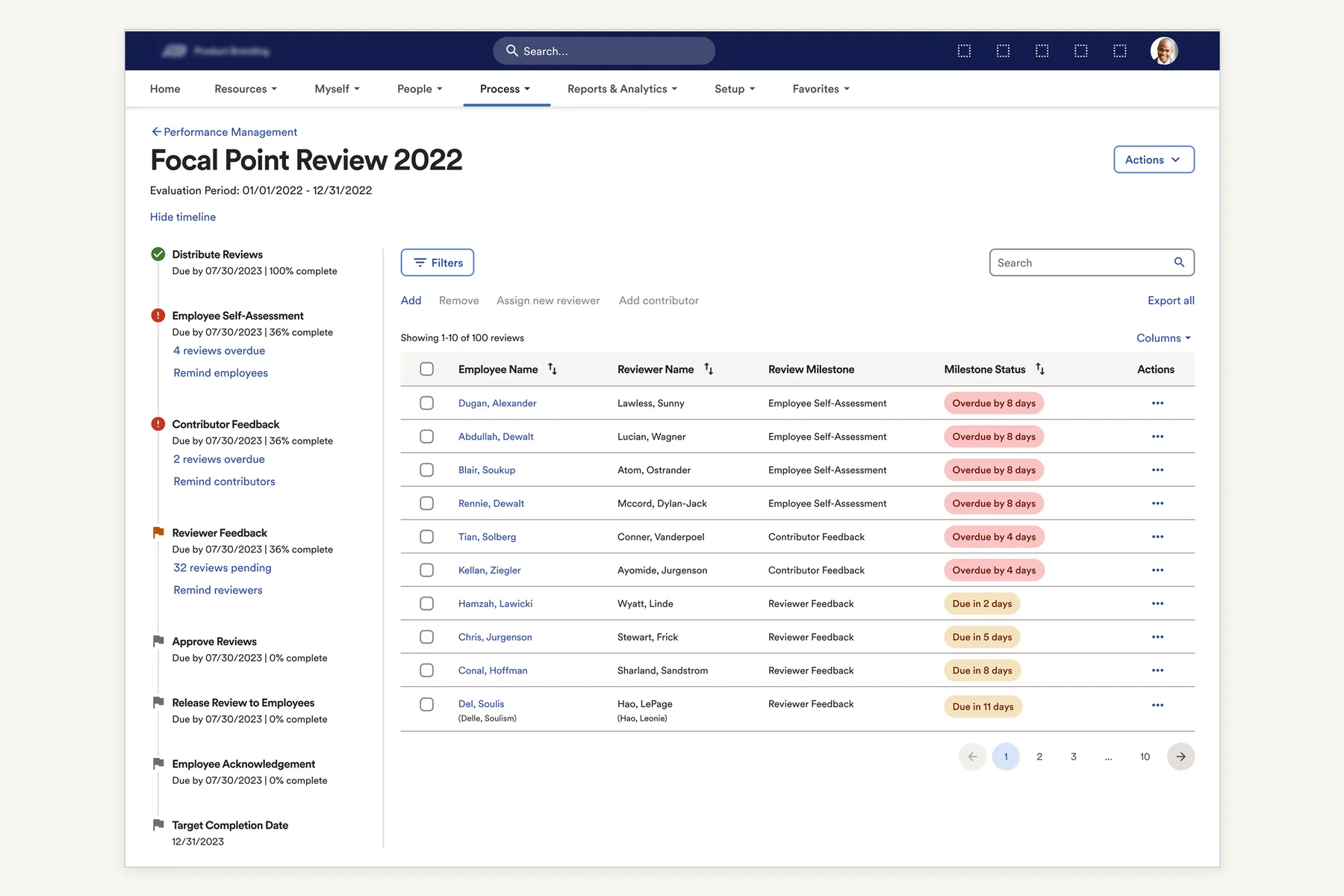
See progress at a glance
Milestone completion makes the overall cycle state visible.
Turn status into action
"Overdue by 8 days" tells practitioners what needs attention.
Find → identify → act
Filters make it possible to narrow down affected reviews and follow up.
Adapt the workspace to the task
Search, filters, columns and export support different management needs.
The goal wasn't to make the table easier to read. It was to make the next action easier to find.
One system, from setup to action.
The redesign connected three previously fragmented experiences into one continuous workflow.
Set Up
Guided configuration
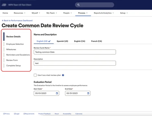
Monitor
Clear review-cycle state
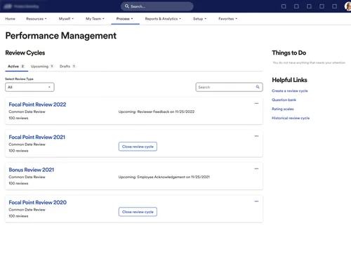
Act
Action-oriented review workspace
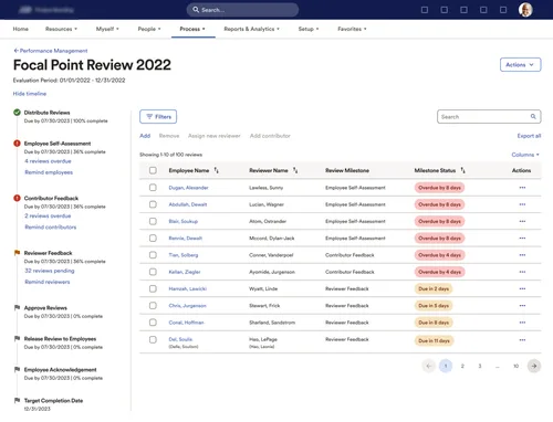
The result was a connected experience that moved HR practitioners from configuring the work → understanding the work → acting on the work.
We tested whether the new experience actually made the complexity easier to navigate.
We ran unmoderated usability testing on the setup and tracking flows before development handoff.
Understand status
Identify where a review cycle stood.
Understand progress
Use the milestone timeline to understand the review process.
Find attention areas
Use milestone/status information to narrow down reviews requiring follow-up.
The experience worked best when the system surfaced the state of the review for the practitioner — rather than asking them to reconstruct it from dates, statuses, and individual records.
From pilot to broader rollout
The redesigned experience moved from pilot to broader rollout, with retention remaining strong after the refresh.
Support-call impact: The project was designed against a goal of reducing related support-call volume by up to 70%. We didn't have a clean, independently verified post-launch measurement, so I'm treating this as a target rather than a confirmed outcome.
What I owned
I shaped the problem as well as the product. I defined the design scope, prioritized the highest-volume workflow, translated research into design priorities, and owned the experience from setup through cycle and individual-review tracking.
Strategy
- Defined the design scope and problem area
- Prioritized Common Date Review based on client usage
- Chose HR practitioners as the starting persona
- Synthesized Pendo, service-call, and competitive research into design priorities
Product design
- Review-cycle setup — six-step wizard
- Milestone configuration
- Reminder & escalation interactions
- Review-cycle landing page
- Review-cycle tracking experience
- Filtering & status model
- Review-form configuration
Collaboration
- Led the Level 1 design / product / development triad
- Used concept and final-design reviews to align Level 2 leadership
- Partnered with UX Research to test and refine concepts
- Partnered with UX Writing through testing and development handoff
How we worked
I kept day-to-day design decisions within the working triad and used leadership checkpoints to align on direction and final experience.
What I deliberately didn't solve
Performance Goals
Goals had already been revamped, so I kept the refresh focused on Reviews where the usage data showed a clearer opportunity.
Lower-volume review types
I started with Common Date Reviews rather than Disciplinary Action, PIP, New Hire, or Anniversary reviews because it represented the largest share of client usage.
Validation depth
We used unmoderated usability testing, which provided directional validation but limited insight into why users behaved a certain way, particularly around edge cases.
The trade-off was intentional: go deeper on the dominant workflow rather than spread the redesign across every review type.
What I'd do differently today
This project taught me that simplifying an enterprise workflow isn't only about reducing the number of screens. The harder part is deciding which complexity the system should absorb, and which complexity the user genuinely needs to control.
Today, I'd bring engineering into the earliest exploration of high-volume tracking surfaces, and pair behavioral data with moderated research to better understand the edge cases outside the dominant workflow.
The goal wasn't to make Performance Management simpler by hiding complexity.
It was to make the complexity manageable.
The redesign didn't remove the complexity of performance reviews. It gave practitioners a clearer way to move through it.